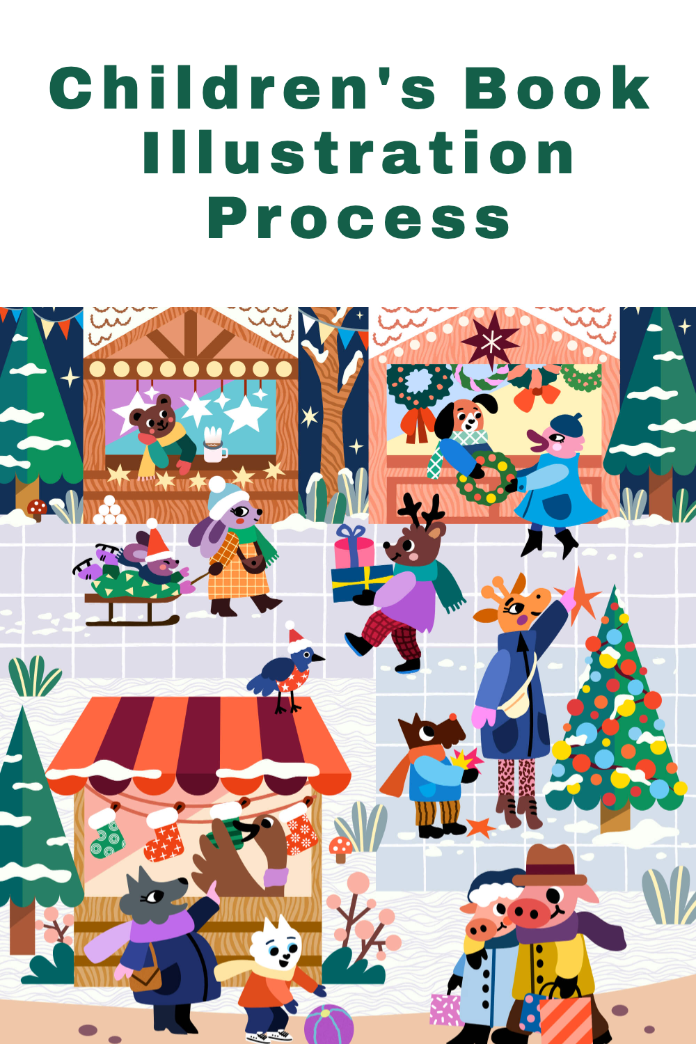
Children’s Book Illustration Spotlight: Christmas Market
This is the first article from the “behind the scenes” series where I am sharing my work in progress insights when illustrating for picture books. Today I’m introducing my Merry Christmas Market children’s book illustration, featuring a few optimistic anthropomorphic animals. Here’s the final version of my illustration for reference:

How I handle complex scenes for picture books
Illustrating complex scenes like the one above can be really daunting. It’s easy to get lost in all the details or not get the colors or the contrast of your illustration right. I had a big AHA moment after watching a very inspiring Domestika course featuring Ben Newman: World Building & Compositional Techniques for Illustration
Despite the fact that this class was for Adobe Illustrator users, it encouraged me to experiment with my own illustration processes in Affinity Designer and it convinced me that I really needed to try some new things out - in order to grow and to improve my old way of working. In essence, you start building your illustration from black or grey shapes (which I’m showing more below), without focusing on your final colors. Why is this so important in particular when working with vector art?
The rigid nature of vectors
Many artists complain that vector art is not for them because it doesn’t allow their art to “flow”. I really get what they mean - vector art in Affinity is really different from raster art in Procreate. Not only are the brushes different, but also the mechanics behind drawing your shapes.
Raster art is more “flowy” because you dab with your pixel-based brushes in a manner that very closely imitates traditional media, such as pencils and paints. This is possible because you are painting with pixels, which are spread out in a very spontaneous manner on your canvas.
Now, vector shapes are a different story! If you’ve been following me for a while, you know I am a huge fan :) I recently wrote another blog post about Why I Love Illustrating Children’s Picture Books With Vectors. Vectors are pretty much maths. They’re lines, points (nodes), paths, shapes. For many “free-spirited” artists out there it may feel like a creative “cage”.
I believe that Adobe Fresco is actually doing a very decent job in offering amazing vector brushes that feel less vector-y, if it makes sense. I still commit to illustrating in Affinity Designer on my iPad because of all the other tools that I’m using there, which make my experience real good! Paired with this new way of working in greyscale, it enabled me to level up my illustrating game.
Try building complex scenes without focusing on your colors at first
In Ben Newman’s technique, you first build your complex world and you color it afterwards. You may already have your final color palette in mind, but you set it aside and you let it be for a while. Next you focus on building your illustration. You block in your shapes mainly in black, and then you lower the opacity of some layers so that you can see better. Alternatively, you could have a greyscale color palette in your software and work with different shades of grey.
For me personally, this technique is so helpful because I believe that I myself am guilty on focusing on my colors way too early. I tend to forget that there is more to creating a good illustration than just its color palette. There’s composition aspects, scale, movement, and value contrast. But instead, especially in my “Procreate art stage”, I would rather focus too much on my colors and my textures, neglecting the other aspects.
This is how it goes…
Now, it all starts with a relatively neat sketch, which I still enjoy drawing in Procreate, and then moving it over to Affinity Designer and blocking in the main “background” shapes:

PRO TIP: at this early stage try to be as organized as you possibly can, group everything (create folders) and name them properly. For complex scenes, this is really a must.
You can see in the picture above that I started by building my background shapes using the Rectangle Tool: the ground, the square, the sidewalk, the sky, the path, and my first Christmas market shops and their roofs. I have my main sketch for reference next to my working canvas, and another copy of that sketch on the canvas with a lower opacity. Let me warn you, this process is not the prettiest :) I showed how this process looks in my last Live Q&A session on YouTube too.
The magic will happen later on when you start coloring. But on the other hand, for me this “building stage” gives me a lot of satisfaction and allows me to stay very focused on my scene and my composition, and I think this is where my improvement happens:
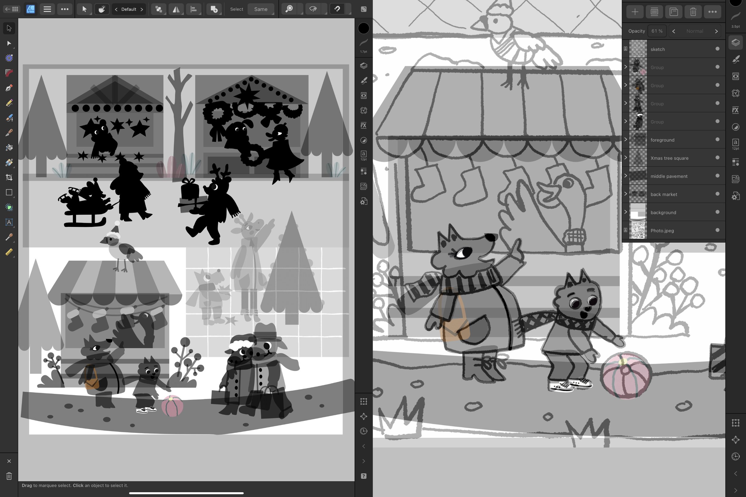
You can probably see that some of the elements are colored (the ball and the handbag), and this is because I have recycled some of the vector assets items from my Assets Studio :) And then I just turned their opacity down so that the don’t dominate.
In this technique, sometimes I work in black and I reduce the opacities of my layers, and some other times, especially when working on individual characters, I just use black and I don’t bother to lower the opacity. So for my individual characters I end up with character silhouettes in black - like that mama rabbit and her kid on the sleigh in the upper part of my illustration, or the reindeer dude carrying his presents. And here’s another advantage - by creating such silhouettes, you can evaluate the shape and the scale of your characters.
And now starts the coloring magic…
After completing your main shapes, without going into too much detail (like patterns on clothes), we are ready to start the coloring! I usually recycle the colors that I enjoyed using in my previous illustrations. This is indeed the best time to focus on your color palette: the mood, the contrast and your artist signature colors (the colors you use more repeatedly). Proceed by choosing the colors for your background elements, like the ground, the sidewalk and the sky.
PRO TIP: in your coloring process, move from the background to the foreground at first.

During this stage, I change the palette quite often, till I’m happy, and I check my value contrast very frequently. In Affinity Designer, you can double-check your contrast in the Navigator menu (lower right corner on the iPad). There you can find an icon with 3 grey rings or color wheels - when you click on it, it will show your illustration in greyscale an you can check your contrast in seconds.
PRO TIP: adjust your colors using the color wheel in the Color Studio by looking at your greyscale illustration.

Take advantage of pre-saved vector assets
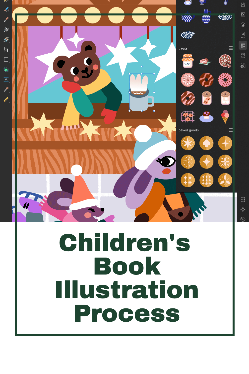
I like to recycle some objects that I would be otherwise drawing over and over again. So while I’m working on a given illustration, I save up some shapes as vector assets (Creating Hand-Drawn Vector Assets in Affinity Designer). You can store them in your Assets Library and insert them into any future work, saving you a lot of time. Check this out, I recently started a new category of kitchen and cafe objects and I was able to “recycle” that coffee mug in my scene:
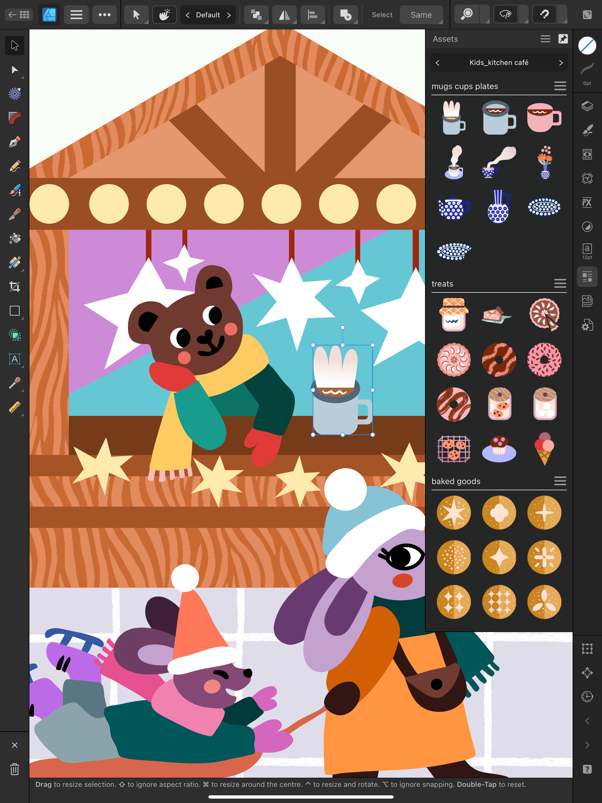
Finally, the last step is to keep adding the details to your artwork: patterns on clothes, textures on the background, little details that add more character to your heroes. This stage is very relaxing because my illustration has all the main values established, the general contrast is all set and the colors are working well together. I can keep adding in the details and I won’t ruin any part of my artwork with bad color decisions etc.
PRO TIP: this is where you can make your character shine, or you can introduce elements of humour for your young audience. Dress your pigeon in a Christmas sweater or give the giraffe cool leggings with a leopard print ;)

I hope that you enjoyed taking a sneak peek behind the scenes of my creative process! Stay tuned for new work-in-progress blog posts on my Instagram or subscribe to my Newsletter to get my newest resources and knowledge posts. Thank you for reading!
Pin for later!